
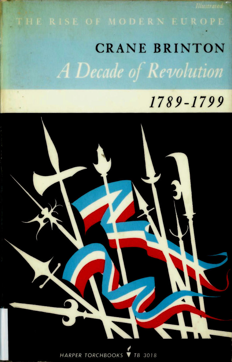
 A Decade of Revolution, Crane Brinton Harper Torchbooks , New York (1963) – Cover Design by Guy Fleming
Most of the interesting book covers I find arrive via the library’s book return book-bin (which is as dull and dispiriting as it sounds; so dispiriting in fact someone has sellotaped a picture of Sisyphus next to it).
With the book-bin, you often get a rash of books on the same topic (usually thrown through the book return slot with relish or anger because the student returning them has just finished their essay or dissertation). Which is why I came across 3 different books about the French Revolution in one fell swoop.
I particularly like the first cover for it’s very deft, graphic styling. Also strangely enough, it reminds me a bit of the box of Jack Straws I used to play with as a child (which I’m sure is pure accident on the part of the designer).
The design features a flat, dynamic central image: a multitude of pikes, spears and axes, mingling with two wavy Tricouleur flags. The flags seem to ripple and flow, the spears, axes and pikes jut out at irregular angles; all of which suggests an angry, revolutionary mob marching or running to battle.
The title banding reflects the stripes of the revolutionary flags below, subtly matching the colours used in the central image. However, no red is used in the title which in turn emphasises the violent red of the flags below.
All in all, it is a very cartoony, very graphic image, where form and meaning are paired to their simplest silhouette.
For my M.A. I read an article by Stewart Medley ( Discerning pictures: how we look at and understand images in comics Studies in Comics, Volume 1, No. 1, April 2010, p.56) which explains how the brain is more stimulated by the unrealistic (or simplified cartoon image) than the realistic, which is all due to the way in which we evolved.
Following on from Medley’s ideas, it would seems then that the silhouette (as one of the most simplified kinds of image) has a powerful visual effect which relates to our primitive survival instincts. Basically, to the primitive part of our brain, a silhouette is like an object seen at distance. At distance an object lacks the detail we can normally see when close-up , and so is more or less a vague, shadowy outline. The silhouette then was something our hunter-gatherer ancestors would have needed to instantly process when tracking or hunting their prey over open ground and at long range (sort of like aircraft recognition silhouettes only for cavemen – think Bison instead of Bomber).
So essentially the silhouette, indeed the strong or bold graphic shape (most prominently those used in logo design) is one of the most compelling forms of image. It pushes a button in our animal mind, which whilst not necessarily saying ‘meat’ or ‘fruit’ in this case, gives us an instant sense or understanding of the term ‘revolution’. The silhouette creates instant recognition of meaning and form.
Anyway, the first book cover appeals to me much more than the other two, which is probably due to the primitive appeal of the silhouette combined with a very affective and dynamic design (and possibly also because it looks like the box my jack-straws came in – sorry).
Also, without getting into a ‘who’s better, who’s best’ type argument, personally I think the first cover is more interesting to look at, which is not to say that the other two are not successful designs.
The success of an academic book cover obviously depends a lot more on simply looking nice. Purchasers of academic text books are seldom likely to buy the book on the basis of how exciting or pretty the cover is (‘ooo look, a book on Qualitative Inquiry and Research Design! I think I’ll give it a whirl because the cover has a pretty picture composed of a dynamic and primitively appealing silhouette on it’ – THIS NEVER HAPPENS!)
 The World of the French Revolution, R. R. Palmer, George Allen Unwin, London (1971) – Cover designer unknown
What about the other two covers ?
Well, both have their own appeal and feature successful elements. I particularly like the font the designer has used on the second cover . It seems pleasingly outdated and quaint to a modern audience which of course chimes with the historical period the book discusses. The font has a fat, wavy, hand-drawn appeal which for me chimes with the idea of luxury and decadence as displayed by the aristocrats on the cover (who are about to lose their fat, wavy and luxurious heads).
However, for all its quaintness today, the font must have been contemporary with it’s publishing date (1971), perhaps a deliberate attempt to revive an old fashioned style (I managed to track down the font in an old edition of Rookledge’s International Type-Finder; which identifies the font as ‘Pretorian’, a modified Serif, decorative font which has 18 / 19th Century overtones). The recycling of old forms as both mockery and celebration was of course a key factor in so much of the sixties and seventies pop-culture (hence all the resurgence of Edwardian and Victorian elements in art, music, fashion and design).
I like the series title plate as well, which again echoes the style of the era depicted. This in turn was probably part of a revivalist fashion in the 18th Century, borrowing as it does from the classical period.
Finally, the use of the contemporary 18th or 19th Century engraving works as a piece of documentary evidence and adds a sense of being a window into the world depicted. This effect is further enhanced by the black bands above and below the image, giving I think, the sense of watching a slide-show.
Using a contemporary engraving for a history book is obviously a good idea as the designer for the third and last book also used it.
 The French Revolution, T. C. W. Blanning, Macmillan Press, Baisingstoke (1988) – Cover designer unknown
I really included this final cover as a contrast to the other two. I think that it is the plainest, and in some ways the dullest of the 3. And to some extent, shows how unimaginative modern text-book covers can be. As if, due to the very fact that no one buys a text-book for its cover, it simply isn’t worth anyone’s time, effort or obviously more importantly, MONEY, to create something a bit more dynamic or visually appealing.
However, that is not to say that the 3rd book is entirely without merit. For instance, the use of the copperplate font for ‘the’ is more in-keeping with the period than that used on the 2nd cover. This is also true of the Roman font used for the main title and author.
The branding stripe of yellow jars a little with the more sombre black band at the bottom (black for mourning, black for death), but the red wavy Macmillan logo (derived from the letter ‘m’ but also suggesting a proud flag flying or waves carrying a flow of information – or so I presume) has that instant sense of visual identity which pushes our primitive ancestry buttons (I see a pinball machine shaped like a brain on which, ‘ping’ a picture of the Macmillan logo lights up followed by Boris Karloff’s voice from ‘Frankenstein’ saying, ‘Macmillan, gooood’). And of course the cover tells you in no uncertain terms what the book is about, who it was written by and which edition it is .
So yes, vive la revolution but more importantly, vive la silhouette (‘silhouette, goood’)!