Get That Cool, Fresher Feeling (With The University of Life)

Just click on the image below to enjoy it in all it’s 2D glory, or why not see it along with all its puny ancestors on the University of Life Gallery page.  Go on, try it, it’s a bit like a real comic!

So once again I have to apologise for the fact that it’s been four weeks since the last U.O.L. post,  not the two I promised; but there you are, the best laid thingumies of thingumies and all that.  Besides, four weeks is nothing compared the age it seemed to take to produce this new strip.  For some reason, from rough sketch, to ink outline, to computer colour, to lettering, it seemed to take months AND months also into the bargain.

I think it has benefited from the time I spent on it.  I would even go so far as to say in my very humble opinion (oh so very humble) that  it looks fairly good.  In an ideal world this is how I’d love every one of the U.O.L. strips, indeed all my work to look like (although come to think of it I’d actually like all my work to look like Will Eisner’s work or Brian Bolland’s or probably most of like Joe Colquhoun’s – or jut a lot better than it is).  Unfortunately, during the long drawn-out process of producing this and the next three strips, I came to realise that unless someone pays me for my work so that I can spend all day AND night drawing, rather than just at night, and on lunch breaks and the odd hour on the weekend between domestic stuff; I’ve really got to speed up if I want to keep up with all my ideas!

So enjoy this carefully crafted and painstakingly coloured strip and the next three over the weeks / months to come.  Hopefully the new less improved but decidedly quicker delivered model will arrive soon.

Return to the Univerity of Life

So yes, the plan was to post a University of Life ‘strip’ every couple of weeks.  Therefore here is my latest University of Life cartoon … four weeks after I posted the previous one.  Oh well, ‘the best laid plans of mice and men gang aft aglay’ and all that … or as George Lucas might put it: ‘the best laid plans of scraglings and mumpwumps gang after askriggen’ (old Tatooinain proverb it is).

Just click on the image to see it in all it’s (larger) 2D glory and then click again to see it in High Definition … or basically to see it less fuzzy than before.

See you again in two, or three, or four weeks … hopefully…or should that be: ‘hopefully again in two weeks I shall see you’?

Welcome to The University of Life

Welcome to the University of Life, undoubtedly the greatest higher-education establishment in the known universe (well certainly in terms of sheer size anyway).

Just click on the image to see the University in all its 2D glory.

The University of Life is one of my main creative outlets at the moment.  I started drawing single pages about the planet-sized University during my M.A.  I suppose it started as an escape from  my rather dry and serious academic work – a sort of safety valve for my sanity if you like.

So far I haven’t run out of steam … to vent  (it does help that I still work for a Higher Education establishment, which provides much fuel for my ideas (and probably just as much frustration – hence all the steam which requires er,  venting).

I have some more strips in reserve and I am currently working on some smaller, newspaper style strips.   I’ll post them every couple of weeks or so and then keep them all together on the handy University of Life page which I have created.

So I hope you enjoy this the very first strip, as I hope you’ll enjoy those which will follow….

I feel I ought to say something more dramatic by way of conclusion, such as ‘Excelsior!’ or ‘Make Mine Marvel!’ or even ‘Kowabunga!’ [sic].  But then that’s not really my style.  So, erm, yes, instead I’ll just say: ”bye for now’.  ‘Bye for now.

Automatic Drawing: Data Protection In the Library

Here is my latest ‘doodle’ or Automatic Drawing if you will.  I call it ‘Data Protection in the Library’.

So anyway, you know how it goes:  there’s a meeting  you can’t get out of.  You head to the meeting room, making sure that you’re not too early or too late (either  of which would attract the attention of the meeting-holder).  You creep in and seat yourself strategically (not too near the front in case you catch the speaker’s eye, not too near the back in case you look like a difficult customer).  You have your notebook and pen in hand so as to appear eager and alert.

The meeting or presentation begins.  You carefully write down the title or topic, whilst a PowerPoint slowly unfolds behind the presenter.

A few minutes pass.  You try, you really try to appear interested and focused so you write something down; the title of the presentation perhaps or an important bullet point … and then … you can’t help it, you start to DRAW!

At least that’s how it happens with me.  Usually my focus shifts from the meeting after about five or ten minutes.  Often I stop paying attention because the topic or agenda is dull, or the speaker even duller.

Or perhaps the reason for my compulsive doodling has nothing to do with the quality or content of the meeting I’m in but  lies rather in the fact that I just have an odd, airy-fairy brain or even more likely, a very poor attention-span.

Whatever the reason or reasons for my habitual  doodling, I’ve been doing it most of my adult life.  In fact I think the habit started even further back than that, possibly as early as the second or third year of Lower School (they gave us ‘jotters’  so that we wouldn’t deface our normal exercise books, basically sanctioning doodling by giving us a whole – albeit small – exercise book devoted solely to private ‘jottings’ – how was I not going to doodle then?!).

So it’s a long-term problem which I’m sure I’m not alone in suffering … and yet, despite the consternation of various teachers and managers,  part of my subconscious seems to have been working during these moments of unconscious absenteeism.  Somehow information and knowledge seeped into my brain and I passed exams and got jobs.  So it can’t be all that bad a habit, plus I have usually been left with a fairly interesting drawing at the end of it. So I suppose it’s one of those ‘win win’ situations ….

I’m sure there’s some research that will prove that some types of brains learn better by doodling – although I haven’t come across it yet.  If so I would hazard a guess that such research might  link the appeal of the basic image or icon and its visual stimulation of the primitive learning recognition centres of the brain (thus the brain prefers an image to a piece of spoken information) with the ability to associate terms or phrases with an image – or something.

To whit:  during a lesson, sermon, meeting or presentation, as we inscribe an image on the paper,  a piece of information is given at the same time.  The unconscious brain therefore associates or links the image with the information, even if the image has nothing at all to do with the subject being given or discussed.  Finally, when the images are scanned again, something of the original information (which is now linked or bound up with the image) should be recalled or at least ‘uploaded’ from subconscious to the conscious brain – I guess.

I guess this because I often find that if for instance I’m doing a drawing and there’s a play or piece of music going on in the background, when I look at the picture at a later date (though not too late; say within a few days of doing the drawing), I can recall the exact process or the various stages of the drawing; and vice versa.

There must be something similar happening with the use of the doodle or automatic drawing.

And just to prove I’m not entirely whistling in the dark (despite having absolutely nothing to base my theory on except my own limited experience), the RSA (the Royal Society for the Encouragement of Arts, Manufactures and Commerce) seem to have adopted the idea that doodles make good companions to lectures.  Just check out one of their animations at:  http://www.youtube.com/watch?v=1bqMY82xzWo    (also you can find more examples or ‘projects’ at the main RSA site: http://www.thersa.org/) where you will see they openly practise (and no doubt make a profit and win awards for) what you and I have been hiding whilst our teacher or  boss was looking the other way (although admittedly the RSA doodles tend to ‘tell’ the story of the lecture in pictorial form, a bit like a ‘comic’ – not as in my case sticking a random collection of weird faces and buildings on an empty lined page in order to stave off total boredom / brain-death) .

So, yes, coming back to the title of this drawing …

there I was in a meeting concerning data protection in the library … what happened next, I’m sure you’ll be able to guess.

Three Revolutions Per Blog

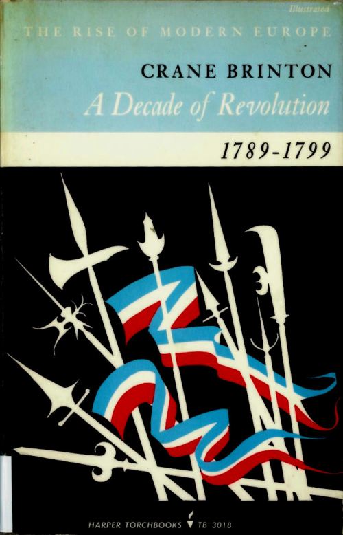
A Decade of Revolution, Crane Brinton Harper Torchbooks , New York (1963) – Cover Design by Guy Fleming

Most of the interesting book covers I find arrive via the library’s book return book-bin (which is as dull and dispiriting as it sounds; so dispiriting in fact someone has sellotaped a picture of Sisyphus next to it).

With the book-bin, you often get a rash of books on the same topic (usually thrown through the book return slot with relish or anger because  the student returning them has just finished their essay or dissertation).  Which is why I came across 3 different books about the French Revolution in one fell swoop.

I particularly like the first cover for it’s very deft, graphic styling.  Also strangely enough, it reminds me a bit of the box of Jack Straws I used to play with as a child (which I’m sure is pure accident on the part of the designer).

The design features a flat, dynamic central image: a multitude of pikes, spears and axes, mingling with two wavy Tricouleur flags.  The flags seem to ripple and flow, the spears, axes and pikes jut out at irregular angles; all of which suggests an angry, revolutionary mob marching or running to battle.

The title banding reflects the stripes of the revolutionary flags below,  subtly matching the colours used in the central image.  However, no red is used in the title which in turn emphasises the violent red of the flags below.

All in all, it is a very cartoony, very graphic image, where form and meaning are paired to their simplest silhouette.

For my M.A. I read an article by Stewart Medley ( Discerning pictures: how we look at and understand images in comics Studies in Comics, Volume 1,  No. 1,  April 2010,  p.56) which explains how the brain is more stimulated  by the unrealistic (or simplified cartoon image) than the realistic, which is all due to the way in which we evolved.

Following on from Medley’s ideas, it would seems then that the silhouette (as one of the most simplified kinds of image) has a powerful visual effect which  relates to our primitive survival instincts.  Basically, to the primitive part of our brain, a silhouette is like an object seen at distance.  At distance an object  lacks the detail we can normally see when close-up , and so is more or less a vague, shadowy outline.  The silhouette then was something our hunter-gatherer ancestors would have needed to instantly process when tracking or hunting their prey over open ground and  at long range (sort of like aircraft recognition silhouettes only for cavemen – think Bison instead of Bomber).

So essentially  the silhouette, indeed the strong or bold graphic shape (most prominently those used in logo design) is one of the most compelling forms of image.  It pushes a button in our animal mind, which whilst not necessarily saying ‘meat’ or ‘fruit’ in this case, gives us an instant sense or understanding of the term ‘revolution’.  The silhouette creates instant recognition of meaning and form.

Anyway, the first book cover appeals to me much more than the other two, which is probably due to the primitive appeal of the silhouette combined with a very affective and dynamic design (and possibly also because it looks like the box my jack-straws came in – sorry).

Also, without getting into a ‘who’s better, who’s best’ type argument, personally I think the first cover is more interesting to look at, which is not to say that the other two are not successful designs.

The success of an academic book cover obviously depends a lot more on simply looking nice.  Purchasers of academic text books are seldom likely to buy the book on the basis of how exciting or pretty the cover is (‘ooo look, a book on  Qualitative Inquiry and Research Design! I think I’ll give it a whirl because the cover has a pretty picture composed of a dynamic and primitively appealing silhouette on it’ – THIS NEVER HAPPENS!)
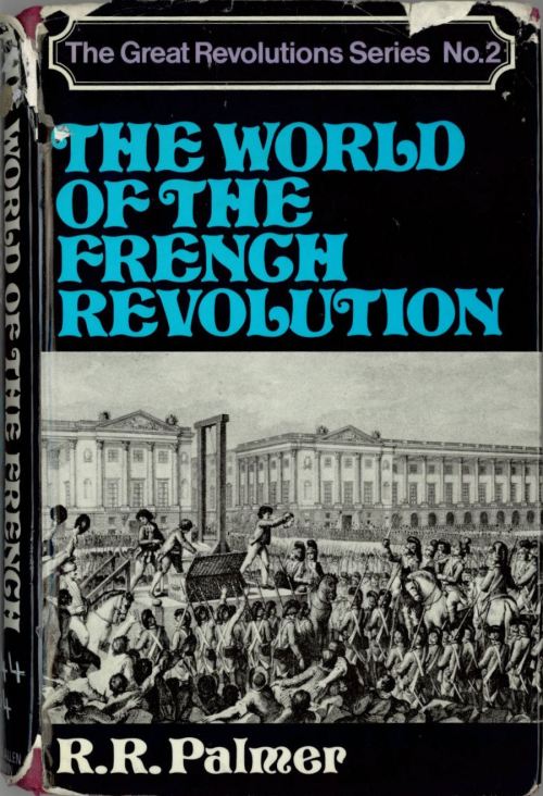
The World of the French Revolution, R. R. Palmer, George Allen Unwin, London (1971) – Cover designer unknown

What about the other two covers ?

Well, both have their own appeal and feature successful elements.  I particularly like the font the designer has used on the second cover .  It seems pleasingly outdated and quaint to a modern audience which of course chimes with the historical period the book discusses.  The font has a fat, wavy, hand-drawn appeal which for me chimes with the idea of luxury and decadence as displayed by the aristocrats on the cover (who are about to lose their fat, wavy and luxurious heads).

However, for all its quaintness today, the font must have been contemporary with it’s publishing date (1971), perhaps a deliberate attempt to revive an old fashioned style (I managed to track down the font in an old edition of Rookledge’s International Type-Finder; which identifies the font as ‘Pretorian’, a modified Serif, decorative font which has 18 / 19th Century overtones).  The recycling of old forms as both mockery and celebration  was of course a key factor in so much of the sixties and seventies pop-culture (hence all the resurgence of Edwardian and Victorian elements in art, music, fashion and design).

I like the series title plate as well, which again echoes the style of the era depicted.  This in turn was probably part of  a revivalist fashion in the 18th Century, borrowing as it does from the classical period.

Finally, the use of the contemporary 18th or 19th Century engraving works as a piece of documentary evidence and adds a sense of being a window into the world depicted.  This effect is further enhanced by the  black bands above and below the image, giving I think, the sense of watching a slide-show.

Using a contemporary engraving for a history book is obviously a good idea as the designer for the third and last book also used it.
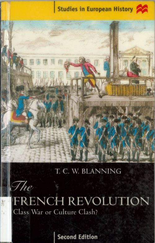
The French Revolution, T. C. W. Blanning, Macmillan Press, Baisingstoke (1988) – Cover designer unknown

I really included this final cover as a contrast to the other two.  I think that it is the plainest, and in some ways the dullest of the 3.  And to some extent, shows how unimaginative modern text-book covers can be.  As if, due to the very fact that no one buys a text-book for its cover, it simply isn’t worth anyone’s time, effort or obviously more importantly, MONEY, to create something a bit more dynamic or visually appealing.

However, that is not to say that the 3rd book is entirely without merit.  For instance,  the use of the copperplate font for ‘the’ is more in-keeping with the period than that used on the 2nd cover.  This is also true of the Roman font used for the main title and author.

The branding stripe of yellow jars a little with the more sombre black band at the bottom (black for mourning, black for death), but the red wavy Macmillan logo (derived from the letter ‘m’ but also suggesting  a proud flag flying or waves carrying a flow of information – or so I presume) has that instant sense of visual identity which pushes our primitive ancestry buttons (I see a pinball machine shaped like a brain on which, ‘ping’ a picture of the Macmillan logo lights up followed by Boris Karloff’s voice from ‘Frankenstein’ saying, ‘Macmillan, gooood’).  And of course the cover tells you in no uncertain terms what the book is about, who it was written by and which edition it is .

So yes, vive la revolution but more importantly, vive la silhouette (‘silhouette, goood’)!

Dad

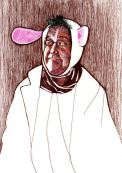
It was my Dad’s 70th birthday on Saturday and so to commemorate the occasion I drew a portrait of him.

I was a little worried that he might not like it as it portrayed him without gloss and fairly straight-forwardly as the spry old man he is (though of course, if as they say, 60 is the new 40, he is in fact not such an ‘old man’ after all).  But he seemed to like the picture, which was a huge relief.

In terms of technique, I drew the portrait from a photo in pencil onto cartridge paper, then built up the colour tone using ordinary fine-line pens.

I chose to use pen rather than paint as I wanted to get a measure of control (this is probably due to the fact that having spent a lifetime doodling in pen I am conversely fairly hopeless with brush and paint).  I also felt that my natural affinity with the pen would add an element of expressiveness or freedom, the same kind evident in most of my doodles but quite often lacking from my more ‘professional’ or polished work.  Plus I’d already tried this technique with a self-portrait (see my Gravatar thingy, top right corner) which seemed to work OK.

In the end, I think my Dad’s portrait works quite well.  Maybe the technique could now be my thing?  We shall see.

In the meantime, happy birthday Dad.

Automatic Drawing 2 : A Weary Elegance

a weary elegance

I don’t really know where these drawings come from, but most of them seem to be drawings of slightly world weary people like the man above.

I think I read somewhere that repetitively drawing  faces is a symptom of a deep repressed sexual frustration, and as I only seem to draw people with large, exaggerated faces …

Then again, the need to find and recognise faces in abstract places is one of the most primitive and necessary of instincts; and so endlessly drawing strange faces might be some aspect of this primitive desire.

Maybe it’s loneliness or a god-like impulse to create my own, better population albeit in biro.

Perhaps I’m just best at drawing faces.  I really  struggle with making up backgrounds and drawing accurate perspective.

Bottom line is: I dunno, really.  And that I suppose is the essence of ‘Automatic Drawing’ as the Surrealists would have it (or doodling as everyone else might say).  Such drawings are pulled up (drawn) from some deep dark and uncertain source which we choose to call the subconscious.

Which is why, incidentally, I always have to make a title up afterwards, like the slightly odd one above.  I really have no idea what the drawing is about until I stare at it for a while and something pops into my head.  A meaningless yet meaningful title, no doubt dredged up from the deep dark and uncertain source we choose to call the subconscious.

Automatic Drawing 1 : Down But Not Yet Out

Looking over my art-work recently I came to the conclusion that despite all my attempts to improve  and polish my work  my best creations by far seem to be the doodles scribbled in notebooks, on the back of work-rotas and in the margins of minutes of proceedings.  Basically the completely free, often escapist wanderings of my mind and pen.

So as proof of this bold yet self-flagellating comment, I offer the above doodle, hereby  dignified by the appellation ‘Automatic Drawing’ as befits its status as the best part of my creativity.  I also call it, ‘Down But Not Yet Out’ which whilst dignifying the work also adds an enigmatic air so that one is left slightly perplexed and fully conned into believing this is a work of serious art and not just the random scribble of a deranged mind.

More to follow.

Layers of Meaning

Next in my intermittent look at book and magazine cover design, is this splendid and soothing, slightly hypnotic cover for Structuralist Poetics by Jonathan Culler ( Routledge and Kegan Paul, London, 1975 [designer uncredited]).

I’m a big fan of abstract book designs, especially for academic text-books.  There is a certain era of abstract book design that seems to me particularly effective and affective (early 1950s – late 1970s).  The  era from which the above design originates.

Perhaps the proliferation of abstract  book covers during this period was due to the fact that  abstract art was king, standing as it did for modernity and the clear, unsentimental ideology which goes with a sense of being modern.

Perhaps another explanation might be that such designs relied a lot more on the ingenuity and the intellectual rigour of the artists.  Also, because people bought and used a lot more books during that period, there was more money and care put into book production and design and thus artists and designers of quality were attracted to the job.  Or perhaps it was simply that in a less-hurried era, people were given more time to come up with ideas.

Anyway, it’s an interesting  question, but best saved for another day, and perhaps for another thesis.

As to the design itself, I chose  because it rather leaped out at me from the Library shelf.

Not knowing much about the subject matter contained within, my mind instantly went into interpretive overdrive.    My first thought was ‘radiation’; a powerful white-hot core of dynamic structural poetic dissection and analysis … But after a second look I began to think magma slowly cooling around a cold, analytical thesis … but then shouldn’t it be the other way around, the orange growing dimmer and browner to represent the molten slowly cooling crust …?

Of course the most obvious and straightforward meaning which the artist or designer was probably trying to convey, is that the abstract motif symbolises both structure (in the layers) and pattern (in the repetition of the layers).

But then again, it doesn’t have to mean anything, it’s just rather orange, groovy and slightly calming compared with the alarmingly esoteric subject matter.  Just the thing to gaze at in lectures, in order to soothe away the terrible panic which might grip you on realising you didn’t have a clue what the subject was about …

Words as scaffolds? Poems as bricks? Or an analysis and examination of the underpinning structure of a poetical text, and the relationship between recurrent patterns or motifs ….?

I dunno …

Decidedly Sheepish

Yes, I think it’s fair to say that decidedly sheepish is how I feel today.

After bleating a little about the futility of blogging in my last post … someone actually read what I wrote and was kind enough to hit the ‘like’ button.  Which besides being a colossal surprise was also very, very nice.

So the void is not as empty as I thought and thus I retract everything I said about being Nowhere Man … until next time.

Now all that remains is to thank the very kind people or person in a similar manner and to actually get on with creating some less self-indulgent / self-pitying posts!